These are the slides of the talk I gave at the O’Reilly AI conference in London. My first external talk about work at Spotify on personalisation for Spotify home. The focus is how to identify what success means so that the machine learning algorithm (in this case based on multi-armed contextual bandits) captures that users differ into how they listen to music and playlist consumption varies a lot. We show that by basing the reward functions on thresholds based on the distribution of streaming time boosts performance when using counterfactual evaluation methodologies. This is is just the beginning and there will be more to come on this and other research we are doing at Spotify.

Engineering features of  ad quality

This is the second blog post about our  WWW 2016 paper on the pre-click quality of native advertisements. This work is in collaboration with Ke (Adam) Zhou, Miriam Redi and Andy Haines. A big thank you to Miriam Redi for providing examples of visual features.

In a previous post, I reported on a study that led to important insights into how users perceive the quality of native ads. In online services, native advertising is a very popular form of online advertising where the ads served reproduce the look-and-feel of the service in which they appear. Due to the low variability in terms of ad formats in native advertising, the content and the presentation of the ad are important factors contributing to the quality of the ad. The most important factors are, in order of importance:

Aesthetic appeal > Product, Brand, Trustworthiness > Clarity > Layout

Based on this study, we designed a large set of features to characterize these factors. We derived the features from the ad copy (text and image), and the advertiser properties. The text of an ad is made of a title and a description. Most ads have an image. An overview of the features together with their mapping to the reasons is shown below.

Reasons Features
Brand Brand (domain pagerank, search term popularity)
Product/Service Content (topic category, adult detector, image objects)
Trustworthiness Psychology (sentiment, psychological incentives)
Content Coherence (similarity between title and desc)
Language Style (formality, punctuation, superlative)
Language Usage (spam, hatespeech, click bait)
Clarity Readability (RIX index, number of complex words)
Layout Readability (number of sentences, words)
Image Composition (Presence of objects, symmetry)
Aesthetic appeal Colors (H.S.V, Contrast, Pleasure)
Textures (GLCM properties)
Photographic Quality (JPEG quality, sharpness)

Clarity

The clarity of the ad reflects the ease with which the ad text (the title or the description) can be understood by a reader. We measure clarity with several readability metrics (Flesch’s reading ease test, Flesch-Kincaid grade level, Gunning fog index, Coleman-Liau index, Laesbarheds index and RIX index). These metrics are defined using low-level text statistics, such as the number of words, the percentage of complex words, the number of sentences, number of acronyms, number of capitalized words and syllables per words. We also retain these low-level statistics.

Trustworthiness

Trustworthiness is the extent to which users perceive the ad as reliable. We represent this factor by analyzing different psychological reactions that users might experience when reading the ad text.

  • Sentiment Incentives. Sentiment analysis tools automatically detect the overall contextual polarity of a text. To determine the polarity (positive, negative) of the ad sentiment, we analyze the ad title and description with SentiStrength, an open source sentiment analysis tool. We report two values, the probabilities (on a 5-scale grade) of the text sentiment being positive and negative, respectively.
  • Psychological Incentives. The words used in the ad copy could have different psychological effects on users. To capture these, we resort to the LIWC 2007 dictionary, which associates psychological attributes to common words. We look at words categorized as social (e.g. talk, daughter, friend), affective (e.g. happy, worried, love, nasty), cognitive (e.g. think, because, should), perceptual (e.g. observe, listen, feel), biological (e.g. eat, flu, dish), personal concerns (words related to work, leisure, money) and finally relativity (words related to motion, space and time). For both the ad title and the description, we retain the frequency of the words that the LIWC dictionary associates with each of these 7 categories.
  • Content Coherence. The consistency between ad title and ad description may also affect the ad trustworthiness. We capture this by calculating the similarity between the words in the ad title and ad description.
  • Language Style. We analyze the degree of formality of the language in the ad, using a linguistic formality measure, which weights different types of words, with nouns, adjectives, articles and prepositions as positive elements, and adverbs, verbs and interjections as negative. We also include low-level features, such as the frequency of punctuation, numbers, “5W1H” words (e.g. What, Where, Why, When, Where, How), superlative adjectives or adverbs.
  • Language Usage. We parse the text using Yahoo content analysis platform (CAP). From CAP, we get two scores. The spam score reflects the likelihood of a text to be of spamming nature. The hate speech score captures the extent to which any speech may suggest violence, intimidation or prejudicial action against/by a protected individual or group. We also extract a feature telling us whether the ad title is a click-bait. We also retain the frequency counts of words relating to slang and profanity.

Product/Service

Although quality is independent to relevance, some ad categories of ads might be considered lower quality (offensive) than others, and features may be more important for some types of product/service

  • Text. To capture the product or service provided by the ad, we use Yahoo text-based classifier (YCT) that computes, given a text, a set of category scores (e.g. sports, entertainment) according to a topic taxonomy (only top-level categories). In addition, we calculate the adult score, as extracted from CAP, that suggests whether the product advertised is related to adult-related services such as dating websites.
  • Image. To understand the content of the ad from a visual perspective, we tag the ad image with image classifiers, which automatically recognize the objects depicted in a picture (e.g. a person, a flower). For each of the detectable objects, the classifiers output a confidence score corresponding to the probability that the object is represented in the image. Since tag scores are very sparse (an image shows few objects), we group semantically similar tags into topically-coherent tag clusters (e.g. dog, cat will fall in the animal cluster). Examples of clusters include “plants”, “animals”. We also run an adult image detector, and retain the output confidence score as an indicator of the adultness of the ad creative.

We also extract deep-learning based features from the ad images. At this stage, it is not easy to interpret the visual attributes they are linked to (in terms of recommendations), thus we do not describe them. In the graph shown later, the top-50 discriminative deep-learning features are nonetheless shown for completeness (they are referred to as CNNObjectxxx).

Layout

  • Text. Since the ad format of the native ads served on a given platform is fixed, we capture the textual layout of the ad creative by looking at the length of the ad text (e.g. number of sentences or words).
  • Image. To quantify the composition of the ad image, we analyze the spatial layout in the scene using compositional visual features inspired by computational aesthetics research, a branch of computer vision that studies ways to automatically predict the beauty degree of images and videos. We compute a Symmetry descriptor based on the gradient difference between the left half of the image and its flipped right half. We then analyze whether the image follows the photographic Rule of Thirds, according to which important compositional elements of the picture should lie on four ideal lines (two horizontal and two vertical) that divide it into nine equal parts, using saliency distribution counts to detect the Object Presence. Finally, we look at the Depth of Field, which measures the ranges of distances from the observer that appear acceptably sharp in a scene, using wavelet coefficients. We also include an image text detector  to capture whether the image contains text in it.

rule
symmetryjpeg
depth

Aesthetic Appeal

To explore the contribution of visual aesthetics for ad quality, we also resort to computational aesthetics. We extract a total of 43 compositional features from the ad images.

  • Color. Color patterns are important cues to understand the aesthetic value of a picture. We first compute a luminance-based Contrast metric, which reflects the distinguishability of the image colors. We then extract the average Hue, Saturation, Brightness (H,S,V), by averaging HSV channels of the whole image and HSV values of the inner image quadrant. We then linearly combine average Saturation (S ̄) and Brightness (V ̄ ) values, and obtain three indicators of emotional responses, Pleasure, Arousal and Dominance. In addition, we quantize the HSV values into 12 Hue bins, 5 Saturation bins, and 3 Brightness bins and collect the pixel occurrences in the HSV Itten Color Histograms. Finally, we compute Itten Color Contrasts as the standard deviation of H, S and V Itten Color Histograms.

brightness
hue
saturation

  • Texture. To describe the overall complexity and homogeneity of the image texture, we extract the Haralick’s features from the Gray-Level Co-occurrence Matrices, namely the Entropy, Energy, Homogeneity, Contrast.
    texture
  • Photographic Quality. These features describe the image quality and integrity. High-quality photographs are images where the degradation due to image post-processing or registration is not highly perceivable. To determine the perceived image degradation, we can use a set of simple image metrics originally designed for computational aesthetics, independent of the composition, the content, or its artistic value. These are:

Contrast Balance: We compute the contrast balance by taking the distance between the original image and its contrast-equalized version.

Constrastjpeg

Exposure Balance: To capture over/under exposure, we compute the luminance histogram skewness.

exposedjpeg

JPEG Quality: When too strong, JPEG compression can cause disturbing blockiness effects. We compute here the objective quality measure for JPEG images.

JPEGjpeg

JPEG Blockiness: This detects the amount of ‘blockiness’ based on the difference between the image and its compressed version at low quality factor.

BlockyCorrectjpeg

Sharpness: We detect the image sharpness by aggregating the edge strength after applying horizontal or vertical Sobel masks (Teengrad’s method).

Foreground Sharpness: We compute the Sharpness metric on salient image zones only.

blursharpjpeg

Brand

We hypothesize that the intrinsic properties of the advertiser (such as the brand) have an effect of the user perception of ad quality. We use two features: domain pagerank and search volume. The domain pagerank is the pagerank score of the advertiser domain for a given ad landing page. An ad site with a high page rank is one that is linked to by many sites, hence reflecting a known brand. The search volume reflects the raw search volume of the advertiser within Yahoo search logs. This represents the overall popularity of the advertiser and its product/service.

Features importance

We focus on how the features listed above characterize the quality of an ad. To monitor ad quality, we exploit the information provided by the Yahoo ad feedback tool, namely ad offensiveness. Many Internet companies have put in place an afeedbackd feedback mechanisms, which give the users the possibility to provide negative feedback on the ads served. With the Yahoo ad feedback tool, a user can choose to hide an ad, and further select one of the following options as the reason for doing so: (a) It is offensive to me; (b) I keep seeing this; (c) It is not relevant to me; (d) Something else.

Among the many reasons why users may want to hide ads, marking one ad as offensive seems the most explicit indication of the quality of the ad.

We analyze the extent to which each feature individually correlates with offensive feedback rate (OFR). This is the number of time an ad has been marked as offensive divided by the number of time the ad was impressed. We report the correlation between each feature and OFR in the figure below (top-correlated features only). 1 means totally correlated, -1 means totally inversally correlated, whereas 0 means no correlation at all.

featurecor

Correlation between ad copy features and offensive feedback rate

Some features are moderately positively correlated such as “Negative sentiment (Title)” with OFR whereas others are moderately negatively correlated such as “Image JPEG Quality”. This means that ad copy title with highly negative sentiment are more likely to be marked as offensive . Examples of such ads include those with words “hate” or “ugly” in them. Ad images with low quality JPEG are also more likely to be marked as offensive.

Overall we can see that features, such as

  • visual features (e.g. JPEG compression artifacts, reflecting that high quality images are important),
  • text features (e.g. whether the title contains negative sentiments, suggesting that although negative sentiments may attract clicks, they also offend users), and
  • advertiser features (e.g. brand as measured with ad domain page rank, indicating that unknown brands are more likely to be marked as offensive by users.)

correlate with OFR. Interestingly, an ad title starting with a number is likely to belong to an offensive ad. Through manual inspection, we found that many offensive ads’ titles indeed tend to start with numbers, for example “10 most hated…”. Ad copy with lower image JPEG quality are often marked as offensive. A copy with less formal language and expressing negative sentiment in the ad titles are also often marked as offensive by users.

We used these features to build a prediction pre-click quality model, which aimed at predicting which ads will be marked as offensive by many users. Our model reaches an AUC of 0.77. We also deployed a model based on a subset of the above listed features on Yahoo news streams, which reduced the ad offensive feedback rate by 17.6% on mobile and 8.7% on desktop.

What makes an ad preferred by users?

This is the first blog post on a paper that will be presented at WWW 2016 [1], on our work on advertising quality. The focus of this work was the pre-click quality of native advertisements. This work is in collaboration with Ke (Adam) Zhou, Miriam Redi and Andy Haines.

native_exampleIn online services, native advertising has become a very popular form of online advertising, where the ads served reproduce the look-and-feel of the platform in which they appear. Examples of native ads include suggested posts on Facebook, promoted tweets on Twitter, or sponsored contents on Yahoo news stream. On the right, we show an example of a native ad (the second item with the “dollar” sign) in a news stream on a mobile device.

Promoting relevant and quality ads to users is crucial to maximize long-term user engagement with the platform. In particular, low-quality advertising has been shown to have detrimental effect on long-term user engagement. Low quality advertising can have even more severe consequences in the context of native advertising, since native advertisement forms an integrated part of the user experience of the product. For example, a bad post-click quality (quantified by short dwell time on the ad landing page) in native ads can result in weaker long-term engagement (e.g. fewer clicks).

Here we focus on the pre-click experience, which is concerned with the user experience induced by the ad creative before the user decides (or not) to click.

The ad creative is the ad impression shown within the stream, and includes text, visuals, and layout. Due to the low variability in terms of ad formats in native advertising, the content and the presentation of the ad creative are extremely important to determine the quality of the ad.

Our first step was to understand ad quality from a user perspective, and infer the underlying criteria that users assess when choosing between ads.

To this end, we designed a crowd-sourcing study to spot what drives users’ quality preferences in the native advertising domain.

We extracted a sample of ads impressed on Yahoo mobile news stream.  To ensure diversity and the representativeness of our data in terms of subjects and quality ranges, we uniformly sampled a subset of those ads from (1) different click-through rate quantiles;  and (2) five different popular topical categories: “travel”, “automotive”, “personal finance”, “education” and “beauty and personal care”.

We used Amazon Mechanical Turk to conduct our study. We showed users pairs of native ads, and asked them to indicate which ad they prefer, and the underlying reasons for their choice. To eliminate the effect of ad relevance, we presented the users with topically-coherent ads (e.g., ads from the same subject category, such as “beauty”), assuming that, for example, when users are comparing two beauty ads, the preference depends mostly on the ad quality.

Once users chose their preferred ad, we asked them the reasons why they chose the selected ad. To define such options, we resorted to existing user experience/perception research literature. We were inspired by the UES (User Engagement Scale) framework, an evaluation scale for user experience capturing a wide range of hedonic and cognitive aspects of perception, such as aesthetic appeal, novelty, involvement, focused attention, perceived usability, and endurability. Moreover, previous studies in the context of native advertising investigated user perceptions of native ads with dimensions such as “annoying”, “design”, “trust” and “familiar brand”. Similarly, researchers have studied the amount of ad “annoyingness” in the context of display advertising, showing that users tend to relate ad annoyance with factors such as advertiser reputation, ad aesthetic composition and ad logic. Based on these, we provided users with the following options as underlying reasons of their choice:

  • the brand displayed
  • the product/service offered
  • the trustworthiness
  • the clarity of the description
  • the layout
  • the aesthetic appeal

Users were asked to rate each on a five-grade scale: 1 (strongly disagree), to 5 (strongly agree) or NA (not available).

We report  in the following table the percentage of judgements that, for each factor, is assigned to grades 4 or 5 (the user highly agrees this factor affects his or her ad preference choice).

PreClickPref

Underlying reasons of users’ preference of ad pairs based on ad creative.

The most important factors are, in order of importance:

Aesthetic appeal > Product, Brand, Trustworthiness > Clarity > Layout

where “>” represents a significant increase (in ad preferences). Further test showed that, apart from the brand factor, there were not any significant differences. This suggests that the factors affecting user preferences generalize across ad categories.

However, for different ad categories, compared to the general pattern, we observe few small differences. Aesthetic appeal is more important for Automotive, Beauty and Education, than Personal Finance and Travel. For the Travel category, where most ad images were indeed beautiful, aesthetics did not affect much compared to others. For Beauty and Education categories, the product advertised was the most important factor (other than aesthetic appeal) affecting user choices; for Automotive, the brand was crucial. For Personal Finance category, the clarity of the description had a big impact on the user perception of the quality if the ad.

This study provided us important insights into how users perceive the quality of native ads. In a future blog post, I will discuss how we map these insights to engineered features, which we then use to predict the pre-click experience.

Bounce, Shallow, Deep & Complete: Four Levels of User Engagement in News Reading

This is the second blog post on a paper that will be presented at WSDM 2016 [1], on metrics of user engagement using viewport time. This work is in collaboration with Dmitry Lagun, and was carried out while Dmitry was a student at Emory University, and as part of a Yahoo Faculty Research and Engagement Program.

In a previous blog post, I motivated using viewport time (the time a user spends viewing an article at a given viewport position) as a coarse, but more robust instrument to measure user attention during news reading. In this blog, I describe how to use viewport time to classify each individual page view into one of the following four levels of user engagement:

taxonomy

Four levels of User Attention

  • A Bounce indicates that users do not engage with the article and leave the page relatively quickly. We adopt 10 seconds dwell time threshold to determine a Bounce. Other thresholds can be used, for example accounting for genre (politics versus sport) or device (mobile versus tablet)
  • If the user decides to stay and read the article but reads less than 50% of it, we categorize such a page view as Shallow engagement, since the user has not fully consumed the content. The percentage of article read is defined as the proportion of the article body (main article text) having a viewport time longer than 5 seconds. Note that using 50% is rather arbitrary and used only to distinguish between extreme cases of shallow reading and consumption of the entire article.
  • On the other hand, if the user decides to read more than 50% of the article content, we refer to this as Deep engagement, since the user most likely needs to scroll down the article, indicating greater interest in the article content.
  • Finally, if after reading most of the article the user decides to interact (post or reply) with comments, we call such experience Complete. The users are fully engaged with the article content to the point of interacting with its associated comments.

To understand what insights these engagement levels actually bring, we compare them with four sets of measures, by reporting the mean and standard errors between them and viewport time broken down for the engagement levels. This analysis is based on the viewport data for 267,210 page views on an online news website from Yahoo.

  • Dwell time.
  • Viewport time for article header (usually a title which may include small image thumbnail), body (main body of the article), and comment block.
  • Percentage of the total viewport time spent viewing one of the above mentioned regions.
  • Comment clicks showing the number of clicks on the comment block.
forblog

Means and standard errors of the fined grained measures for Bounce, Shallow, Deep and Complete (all with statistical significant differences)

Dwell time and viewport time on head, body and comment increase from Bounce to Complete. We also note that the distribution of the percentage of time among these blocks changes in an interesting manner. The viewport time on head steadily decreases from 0.31 for Bounce to 0.09 for Complete indicating that users spend an increasing amount of time reading content deeper in the article. The percentage of article read steadily increases from Bounce to Complete, as expected. With respect to this, Bounce (12%) and Shallow (23%) clearly represent low levels of engagement with the article, since less than 25% of the article was read. On the other hand, Deep and Complete correspond to the situations when the majority (83%) of the article was read. The number of comment clicks is highest for Complete (3.14), followed by Shallow (0.43), suggesting that users may engage with comments even if they do not read a large proportion of the article.

viewport_time_per_class

Mean viewport time at different viewport positions for each of the levels of user engagement (thickness of the line corresponds to the standard error of the mean)

Finally, we compute the average viewport time at varying vertical position. Each of the four curves corresponds to one of the engagement levels. For the page views in the Bounce case, users rarely scroll down the page, whereas many users in the Shallow case spend approximately another 5 seconds of viewport time at lower scroll positions. Deep engagement is characterized by significant time spent on the entire article (peak at the first screen amounts to about 50 seconds) with a steady position decay of the viewport time towards the bottom. Interestingly, the viewport time profile for Complete engagement no longer monotonically decays with the position; instead it has a bi-modal shape. This could be due to a significant time users spend viewing and interacting with comments, which are normally placed right after the main article content.

Our analysis shows that the proposed four user engagement levels are intuitive, and bring more refined insights about how user engage with articles, than using dwell time alone. We recall that the engagement levels can be derived using the viewport time information, which can be computed through scalable and non-intrusive instrumentation. In a future blog post, I will describe how viewport time can be used to predict these levels of engagement based on the textual topics of a news article.

Viewport time: From user engagement to user attention in online news reading

This is the first blog post on a paper that will be presented at WSDM 2016 [1], on metrics of user engagement using viewport time. This work is in collaboration with Dmitry Lagun, and was carried out while Dmitry was a student at Emory University, and as part of a Yahoo Faculty Research and Engagement Program.

Figure 1 (a): Example page showing a pattern of user attention, which is the most common one when reader’s attention decays monotonically towards the bottom of the article.

Figure 1 (a): Example page showing the most common pattern of user attention, where the reader attention decays monotonically towards the bottom of the article.

Figure 1 (b): Example page showing a pattern of user attention with an unusual distribution of attention indicating that content positioned closer to the end of the article attracts significant portion of user attention.

Figure 1 (b): Example page showing an unusual distribution of attention, indicating that content positioned closer to the end of the article attracts significant portion of user attention.

Online content providers such as news portals constantly seek to attract large shares of online attention by keeping their users engaged. A common challenge is to identify which aspects of the online interaction influence user engagement the most, so that users spend time on the content provider site. This component of engagement can be described as a combination of cognitive processes such as focused attention, affect and interest, traditionally measured using surveys. It is also measured through large-scale analytical metrics that assess users’ depth of interaction with the site. Dwell time, the time spent on a resource (for example a webpage or a web site) is one such metric, and has proven to be a meaningful and robust metric of user engagement in many contexts.

However, dwell time has limitations. Consider Figure 1 above, which shows examples of two webpages (news articles) of a major news portal, with associated distribution of time users spend at each vertical position of the article. The blue densities on the right side indicate the average amount of time users spent viewing a particular part of the article. We see two patterns:

In (a) users spend most of their time towards the top of the page, whereas in (b) users spend significant amount of time further down the page, likely reading and contributing comments to the news articles. Although the dwell time for (b) is likely to be higher (the data indeed shows this), it does not tell us much about user attention on the page, neither it allows us to differentiate between consumption patterns with similar dwell time values.

Many works have looked at the relationship between dwell time and properties of webpages, leading to the following results:

  • A strong tendency to spend more time on interesting articles rather than on uninteresting ones.
  • A very weak correlation between article length and associated reading times, indicating that most articles are only read in parts, not in their entirety. When these two correlate, they do so only to some extent, suggesting that users have a maximum time-budget to consume an article.
  • The presence of videos and photos, the layout and textual features, and the readability of the webpage can influence the time users spend on a webpage.

However, dwell time does not capture where on the page users are focusing, namely the user attention. Hence, the suggestion of using other measurements to study user attention.

Studies of user attention using eye-tracking provided numerous insights about typical content examination strategies, such as top to bottom scanning of web search results. In the context of news reading, gaze is a reliable indicator of interestingness and correlates with self-reported engagement metrics, such as focused attention and affect. However, due to the high cost of eye-tracking studies, a considerable amount of research was devoted to finding more scalable methods of attention measurement, which would allow monitoring attention of online users at large scale. Mouse cursor tracking was proposed as a cheap alternative to eye-tracking. Mouse cursor position was shown to align with gaze position, when users perform a click or a pointing action in many search contexts, and to infer user interests in webpages. The ratio of mouse cursor movement to time spent on a webpage is also a good indicator of how interested users are in the webpage content, and cursor tracking can inform about whether users are attentive to certain content when reading it, and what their experience was.

However, despite promising results, the extent of coordination between gaze and mouse cursor depends on the user task e.g. text highlighting, pointing or clicking. Moreover, eye and cursor are poorly coordinated during cursor inactivity, hence limiting the utility of mouse cursor as an attention measurement tool in a news reading task, where minimal pointing is required. Thus, we propose to use instead viewport time to study user attention.

Viewport is defined as the position of the webpage that is visible at any given time to the user. Viewport time is the time a user spends viewing an article at a given viewport position.

Viewport time has been used as an implicit feedback information to improve search result ranking for subsequent search queries, to help eliminating position bias in search result examination, and to detect bad snippets and improve search result ranking in document summarization. Viewport time was also successfully used to infer user interest at sub-document level on mobile devices, and was helpful in evaluating rich informational results that may lack active user interaction, such as click.

Our work adds to this body of works, and explores viewport time, as a coarse, but more robust instrument to measure user attention during news reading.

Figure 2. Distribution of viewport time averaged across all page views.

Figure 2. Distribution of viewport time averaged across all page views.

Figure 2 shows the viewport time distribution computed from all page views on a large sample of news articles. It has a bi-modal shape with the first peak occurring at approximately 1000 px and the second, less pronounced peak at 5000 px, suggesting that most page views have the viewport profile that falls between cases (a) and (b) of Figure 1. This also shows that on average user spends significantly smaller amount of time at lower scroll positions – the viewport time decays towards the bottom of the page. The fact that users spend substantially less time reading seemingly equivalent amount of text (top versus bottom of the article) may also explain the weak correlation between article length and the dwell time reported in several works.

Although users often remain in the upper part of an article, some users do find the article interesting enough to spend significant amount of time at the lower part of the article, and even to interact with the comments. Thus, some articles entice users to deeply engage with their content.

In this paper, we build upon this observation and employ viewport data to develop user engagement metrics that can measure to what extent the user interaction with a news article follows the signature of positive user engagement, i.e., users read most of the article and read/post/reply to a comment. We then develop a probabilistic model that accounts for both the extent of the engagement and the textual topic of the article. Through our experiments we demonstrate that such model is able to predict future level of user engagement with a news article significantly better than currently available methods.

Story-focused reading in online news

I worked for several years with Janette Lehmann as part of her PhD looking at user engagement across sites. This blog post describes our work on inter-site engagement in the context of online news reading. The work was done in collaboration with Carlos Castillo and Ricardo Baeza-Yates [1].

Online news reading is a common activity of Internet users. Users may have different motivations to visit a news site: some users want to remain informed about a specific news story they are following, such as an important sport tournament or a contentious important political issue; others visit news portals to read about breaking news and remain informed about current events in general.

story-focus
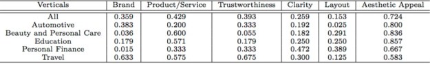
While reading news, users sometimes become interested in a particular news item they just read, and want to find more about it. They may want to obtain various angles on the story, for example, to overcome media bias or to confirm the veracity of what they are reading. News sites often provide information on different aspects or components of a story they are covering. They also link to other articles published by them, and sometims even to articles published by other news sites or sources. An example of an article having links to others is shown on the right, at the bottom of the article.

We performed a large-scale analysis of this type of online news consumption: when users focus on a story while reading news. We referred to this as story-focused reading. Our study is based on a large sample of user interaction data on 65 popular news sites publishing articles in English. We show that:

  • Story-focused reading exists, and is not a trivial phenomenon. This type of news reading differs from a user daily consumption of news.
  • Story-focused reading is not simply a consequence of the fact that some stories are more popular, have more articles written about them, or covered by more news providers.
  • Story-focused reading is driven by the interest of the users. Even users that can be considered as casual news readers (they only read few articles) engage in story-focused reading.
  • When engaged in story-focused reading, users spend more time reading and visit more news providers. Only when users read many articles about a story, the reading time decreases. Our analysis suggests that this could be due to news articles containing mostly the same information.

The strategies that readers employ to find articles related to a story depend on how deep they want to delve into the story. If users are only reading a few articles about a story, they tend to gather all information from a single news site. In the case of deeper story-focused reading, where users are interested in the story details or specific information, they often use search and social media sites to access sites. Furthermore, many users are coming from less popular news sites and blogs, which makes sense, because blogs frequently link their posts to mainstream news sites when discussing an event and users are following these links to likely gather further information or confirm the veracity of what they are reading.

Strategies that keep users engaged with a news site include recommending news articles to users or integrating interactive features (e.g., multimedia content, social features, hyperlinks) into news articles. News providers can promote story-focused reading and increase engagement by linking their articles to other related content. Embedding links to related content into news articles and hyperlinks in general are an important factor that influences the stages of engagement (period of engagement, disengagement, and re-engagement). Having internal links within the article text promotes story-focused reading and as a result keeps users engaged:

It leads to a longer period of engagement (reading sessions are longer) and earlier re-engagement (shorter absence time). Providing links to external content does not have a negative effect on user engagement; the period of engagement remains the same (reading sessions are the same), and the re-engagement begins even sooner (shorter absence time).

This does not mean that news providers should just provide links; they should provide the right ones in terms of quantity and quality. The type, the position, and the number of links play an important role. Users tend to click on links that bring them to other news articles within the same news site, or to articles published by less known sources, probably because they provide new or less mainstream information. However, it is not a good strategy to offer too many such links, as this is likely to confuse or annoy users. Too many inline links can have detrimental effect on users’ reading experience. Finally, when engaged in story-focused reading, users tend to click on links that are close to the end of the article text.

The linking strategies of news providers affect the way users engage with their news sites, which by itself is not new. However, our results are in contradiction with the linking strategy that aims at keeping users as long as possible on a site by linking to other content on the site.

Instead, it can be beneficial (long-term) to entice users to leave the site (e.g., by offering them interesting content on other sites) in a way that users will want to return to it.

News providers could adapt their sites when they identify a user engaging in story-focused reading in various ways:

  • Such information could be integrated in the personalised news recommender of the news site. Story-related articles in the news feed could be highlighted or content frames containing information and links related to the story could be presented on the front page.
  • It might be also beneficial to provide and link to topic pages containing latest updates, background information, blog entries, eye witness reports, etc. related to the story.

Story-focused reading also brings new opportunities for news providers to drive traffic to their sites by collecting the most interesting articles and statements around a story, i.e., becoming a news story curator, and publishing them via social media channels or email newsletters.

Promoting Positive Post-Click Experience for Native Advertising

Since September 2013, I have been working on user engagement in the context of native advertising. This blog post describes our first paper on this work, published at the Industry Track of ACM Knowledge Discovery & Data Mining (KDD) conference in 2015 [1]. This is work in collaboration with Janette Lehmann, Guy Shaked, Fabrizio Silvestri and Gabriele Tolomei.

Feed-based layouts, or streams, are becoming an increasingly common layout in many applications, and a predominant interface in mobile applications. In-stream advertising has emerged as a popular online advertising because it offers a user experience that fits nicely with that of the stream, and is often referred to as native advertising. In-stream or native ads have an appearance similar to that of the items in the stream, but clearly marked with a “Sponsored” label or a currency symbol e.g. “$” to indicate that they are in fact adverts.

A user decides if he or she is interested in the ad content by looking at its creative. If the user clicks on the creative he or she is redirected to the ad landing page, which is either a web page specifically created for that ad, or the advertiser homepage. The way user experiences the landing page, the ad post-click experience, is particularly important in the context of native ads because the creatives have mostly the same look and feel, and what differs mostly is their landing pages. The quality of the landing page will affect the ad post-click experience.

A positive experience increases the probability of users “converting” (e.g., purchasing an item, registering to a mailing list, or simply spending time on the site building an affinity with the brand). A positive post-click experience does not necessarily mean a conversion, as there may be many reasons why conversion does not happen, independent of the quality of the ad landing page. A more appropriate proxy of the post-click experience is the time a user spends on the ad site before returning back to the publisher site:

“the longer the time, the more likely the experience was positive”

The two most common measures used to quantify time spent on a site are dwell time and bounce rate. Dwell time is the time between users clicking on an ad creative until returning to the stream; bounce rate is the percentage of “short clicks” (clicks with dwell time less than a given threshold). On a randomly sampled native ads served on a mobile stream, we showed that these measures were indeed good proxies of post-click experience.

We also saw that users clicking on ads promoting a positive post-click experience, i.e. small bounce rate, were more likely to click on ads in the future, and their long-term engagement was positively affected.

Focusing on mobile, we found that a positive ad post-click experience was not just about serving ads with mobile-optimised landing pages; other aspects of an landing page affect the post-click experience. We therefore put forward a learning approach that analyses ad landing pages, and showed how these can predict dwell time and bounce rate. We experimented with three types of landing page features, related to the actual content and organization of the ad landing page, the similarity between the creative and the landing page, and ad past performance. The later type were best at predicting dwell time and bounce rate, but content and organization features performed well, and have the advantages to be applicable for all ads, not only for those that have been served.

Finally, we deployed our prediction model for ad quality based on dwell time on Yahoo Gemini, an unified ad marketplace for mobile search and native advertising, and validated its performance on the mobile news stream app running on iOS. Analyzing one month data through A/B testing, returning high quality ads, as measured in terms of the ad post-click experience, not only increases click-through rates by 18%, it has a positive effect on users: an increase in dwell time (+30%) and a decrease in bounce rate (-6.7%).

This work has progressed in two ways. We have improved the prediction model using survival random forests and considered new landing page features, such as text readability and the page structure [2]. We are also working with advertisers to help improving the quality of their landing pages. More about this in the near future.

Cursor movement and user engagement measurement

Many researchers have argued that cursor tracking data can provide enhance ways to learn about website visitors. One of the most difficult website performance metrics to accurately measure is user engagement, generally defined as the amount of attention and time visitors are willing to spend on a given website and how likely they are to return. Engagement is usually described as a combination of various characteristics. Many of these are difficult to measure, for example, focused attention and affect. These would traditionally be measured using physiological sensors (e.g. gaze tracking) or surveys. However, it may be possible that this information could be gathered through an analysis of cursor data.

This work [1] presents a study that asked participants to complete tasks on live websites using their own hardware in their natural environment. For each website two interfaces were created: one that would appear as normal and one that was intended to be aesthetically unappealing, as shown below. The participants, who were recruited through a crowd-sourcing platform, were tracked as they used modified variants of the Wikipedia and BBC News websites. There were asked to complete reading and information-finding tasks.

wiki_normal wiki_ugly


The aim of the study was to explore how cursor tracking data might tell us more about the user than could be measured using traditional means. The study explored several metrics that might be used when carrying out cursor tracking analyses. The results showed that it was possible to differentiate between users reading content and users looking for information based on cursor data. They also showed that the user’s hardware could be predicted from cursor movements alone. However, no relationship between cursor data and engagement was found. The implications of these results, from the impact on web analytics to the design of experiments to assess user engagement, are discussed.

This study demonstrates that designing experiments to obtain reliable insights about user engagement and its measurement remains challenging. Not finding a signal may not necessary means that the signal does not exist, but that some of the metrics used were not the correct ones. In hindsight, this is what we believe happened. The cursor metrics were not the right ones to differentiate between the levels of engagement experience as examined in this work. Indeed, recent work [2] showed that more complex mouse movement metrics did correlate with some engagement metrics.

  1. David Warnock and Mounia Lalmas. An Exploration of Cursor tracking Data. ArXiv e-prints, February 2015.
  2. Ioannis Arapakis, Mounia Lalmas Lalmas and George Valkanas. Understanding Within-Content Engagement through Pattern Analysis of Mouse Gestures, 23rd International Conference on Information and Knowledge Management (CIKM), November 2014.

A small note about being a woman in computer science

Today I attended an event about women in Computer Science (CS). I have attended many of them before. I was surprised that the same issues were discussed again and again after more than 15 years. I also heard of stories of women being advised against a career in CS or specific CS subjects. I also heard about sexual harassment at technical conferences.

I don’t know why (maybe I was very lucky), but I can’t remember experiencing much of these. Maybe my worst experience was when I attended a formal dinner for professors in Science & Engineering (I just became professor): there was 120 attendees and about 10 women. I didn’t understand the dress code (lounge suits) and I arrived with black jeans, black top and boots: one professor asked me for the “wine”.

One recommendation I often hear is to find a role model. I didn’t have any role model. Also why do I want to be like somebody? This does not mean that I was not inspired by people (men and women).

I was lucky to work with people that have been very supportive, in particular in helping me with my lack of confidence (which is still there). Those are the people who made a big difference to me, and have helped me to reach where I am.

Some people tried to help me to become more “successful” (whatever this means!): be more aggressive, speak more, speak louder, be more up-front, … , all things that I have always been struggling with. I did try to follow their advises as I wanted to be “more successful”. I even attended a voice course. I learned that to get a deeper voice, I should push my tummy out!!! No way 🙂

I really appreciate people trying to make me “more successful” … but after a while … I said “this is not me, it does not make me happy, and I don’t want it”.

What I am trying to say: listen to advices and recommendations, and decide what is RIGHT for you. Change what YOU think should change while remaining you. Take responsibility. And enjoy being you.